Designing a kid’s room is an art that requires a delicate balance between functionality, safety, and the child’s individuality. However, it’s not uncommon to encounter a myriad of challenges that can hinder the creation of a truly enriching and safe space for our little ones. In this article, we’ll explore 10 common mistakes in kid’s room design and delve into the right solutions for each. If you are looking for tips to design your nursery room, here is another post for detailed information.
1. Overcrowding and Lack of Play Space
A common mistake is stuffing the room with too many items, leaving little room for play. A cluttered environment can hinder a child’s creativity and impede physical activities. The solution lies in decluttering, prioritizing essential items, and creating dedicated play zones within the room.
Strike a balance with the number of toys and books. Too many can be overwhelming, while too few may limit stimulation. Rotate toys and books regularly to keep the child engaged and interested (I do it each three months and she is happy to see her old friends again!).
2. Undefined Zoning
Define different zones within the room for various activities, such as play, study, hide, and sleep. This enhances organization and ensures a well-balanced environment.

3. Insufficient Storage for Tidiness
Too few storage options often lead to a disorganized room. Invest in smart storage solutions, such as bins, shelves, and storage furniture, to ensure that toys and belongings have designated spaces. This not only keeps the room tidy but also teaches children the importance of organization.

4. Lack of Safety
Prioritize safety by securing furniture to the walls, using childproof locks, and ensuring the room layout is free from potential hazards. Provide non-slip rugs and ensure the flooring is safe for play. This prevents accidents and adds a comfortable touch to the room.
5. Inadequate Darkening and Lightning Options
A child’s midday nap requires a darkened environment. Opt for blackout curtains or blinds that effectively block out sunlight, creating a conducive space for rest.
On the other side, ensure the room is well-lit during the day. Natural light promotes a positive atmosphere. Additionally, incorporate soft lighting for evenings to create a calming bedtime routine.
6. Forgetting about Color Balance
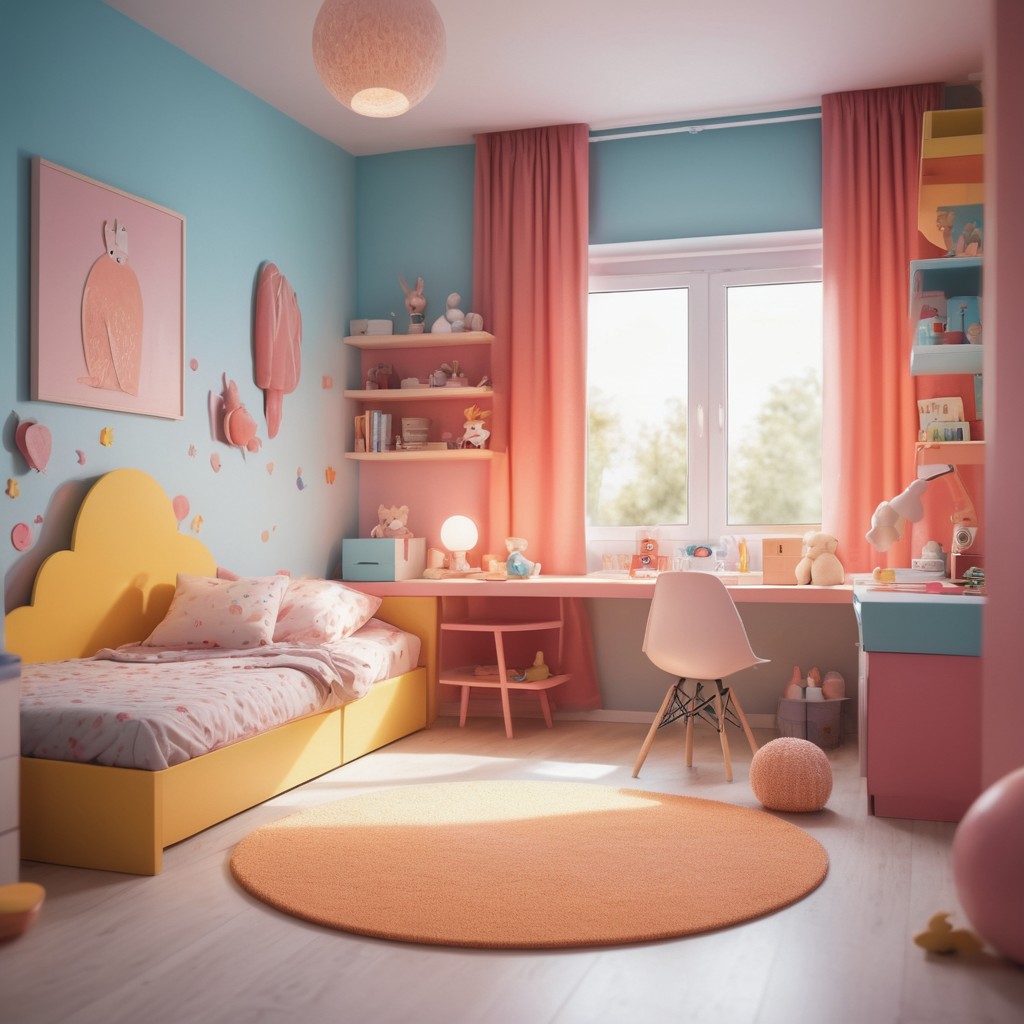
Striking the right balance between too many and too few colors is essential. A mix of vibrant and neutral tones creates a stimulating yet calming atmosphere. Let the child’s preferences guide the color palette for a personalized touch.

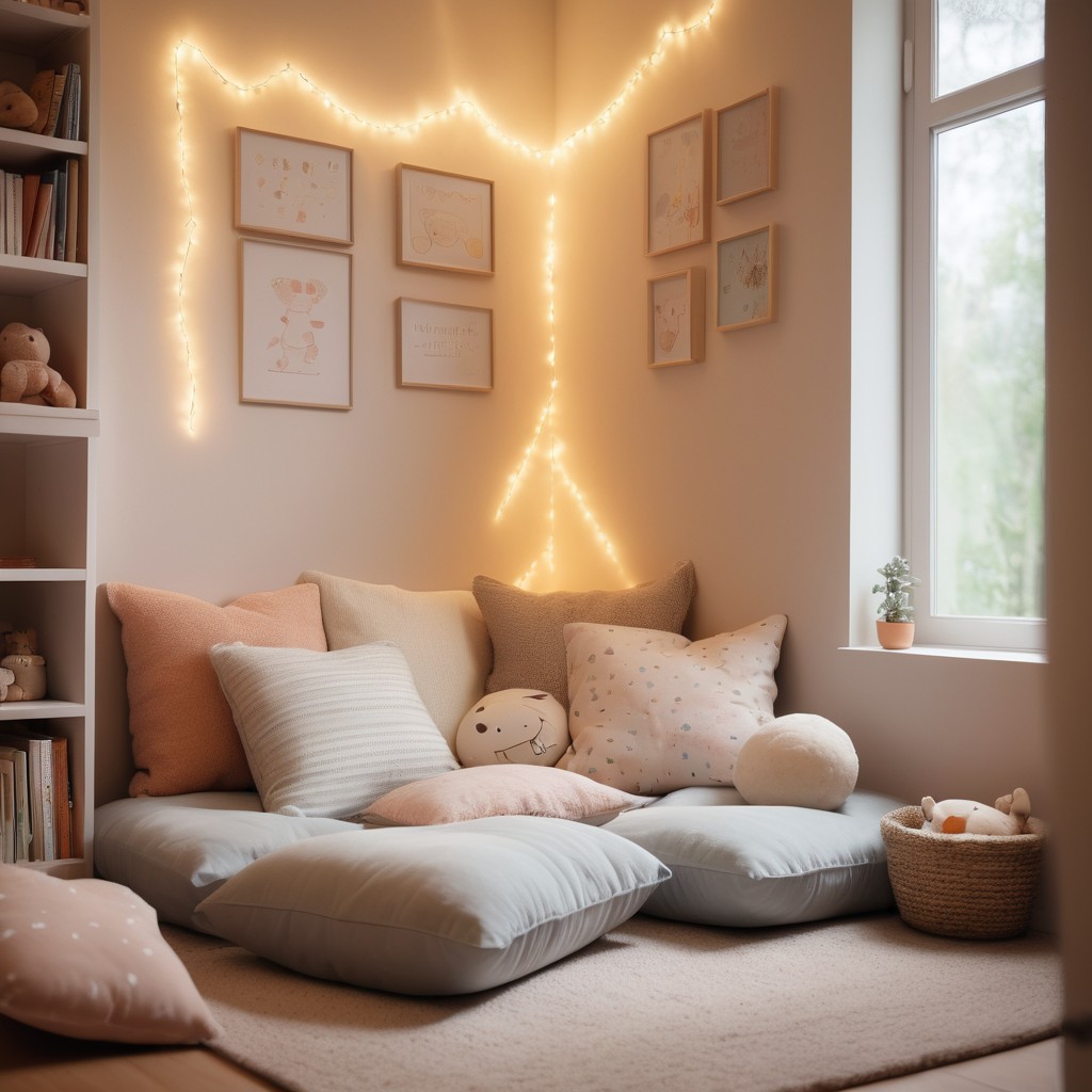
7. Lack of Hideaway and Cozy Spaces
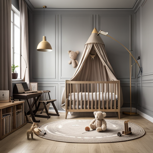
Every child needs a cozy corner where they can hide and have some alone time. Create nooks or use canopies to offer a sense of seclusion. These spaces provide a refuge for a child’s imagination to flourish.
Moreover, a kid’s room should offer cozy spots for reading, napping, or contemplation. Include comfortable seating, soft rugs, and cushions to create inviting corners where children can unwind and let their imagination roam.

8. Absence of Kid’s Activity Furniture and Stuffs
A kid’s table is a versatile piece of furniture that serves as a hub for various activities. Ensure there’s a designated space for eating, snacking, playing puzzles, crafting, and painting. This fosters independence and creativity in children.
On the other side, children love to climb. Integrate climbing elements or a small indoor climbing structure to promote physical activity and enhance motor skills. Ensure these features are safe and age-appropriate!
9. Inaccessible Clothes, Books and Toys
Choose child-friendly closets and drawers that allow the child to access and hang their clothes independently. Consider installing wall-mounted hooks at your child’s eye level for the convenient and immediate hanging of outdoor clothes upon their return home. This promotes a sense of responsibility and organization.
If books and toys are placed beyond a child’s reach, it can be frustrating. Install low shelves or dedicated children’s bookcases to make items easily accessible. This promotes a sense of ownership and encourages reading.
10. Child-Centric Design
Lastly, always consider the child’s preferences! Involve them in the design process, taking into account their favorite colors, themes, and interests. This personal touch makes the room truly theirs.
Designing a kid’s room is a multifaceted endeavor that demands thoughtful consideration. Don’t rush! Take your time and enjoy the process. By addressing these common mistakes with practical solutions, we can create a space that not only captures the essence of childhood but also promotes safety, organization, and the development of a child’s individuality. Striking the right balance ensures that a kid’s room becomes a haven of creativity, exploration, and joy.

Leave a Reply