At the very beginning of your interior design journey, one of the foundational steps is to select a color palette. Think of it as laying the groundwork for the entire design process. Just like an artist starts with a blank canvas and carefully chooses their colors before creating a masterpiece, you start with an empty room and choose your colors to craft your own unique living space.
Choosing a color palette sets the tone, mood, and overall vibe of the room. It’s like setting the stage for the story your room will tell. This step guides your other design decisions, like selecting furniture, fabrics, and accessories.
When you choose a color palette early on, you’re creating a roadmap that will help you make choices that work together harmoniously. The colors you choose will influence how you and others feel when you’re in the room. They can make a room feel cozy and inviting, lively and energetic, or calm and relaxing.
Your color palette also acts as a unifying thread, tying different elements of the room together. It ensures that everything from the walls to the smallest decorative items share a common language of colors. This visual consistency transforms your space into a well-designed and aesthetically pleasing environment.
So, when you start designing a room, remember that your first step is to choose a color palette. This post helps you to set the stage, guides your choices, and ultimately helps you create a space that is not just visually appealing, but also reflective of your personal style and the ambiance you want to achieve. But first thing first, what do we mean by “Color Palette”?
What is a Color Palette?
Imagine you’re creating a beautiful painting, but instead of using a canvas, you’re painting a room. This is where a color palette in interior design comes into play. A color palette is like a carefully chosen set of colors that work together to give a room a certain mood, style, and atmosphere.
Think of the color palette as a team of colors that collaborate to make your room look and feel just the way you want. Just like a team, each color has its own role:
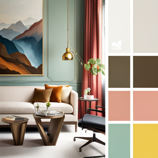
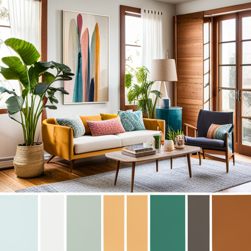
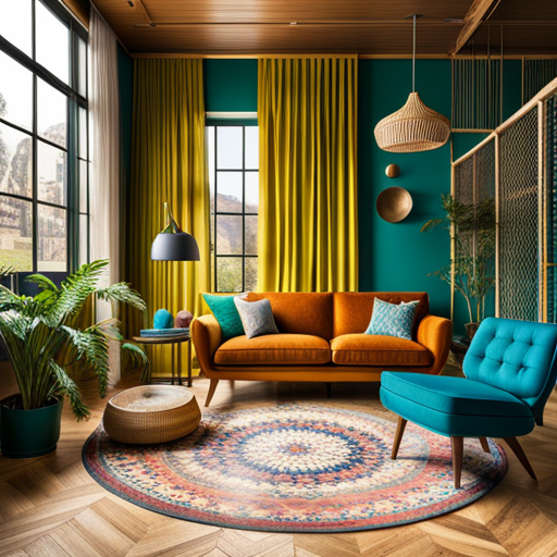
1. Main Color (Dominant): This is the star player. It’s the color that covers the largest areas of the room, like the walls or the main furniture. It sets the overall tone and style of the space.
2. Accent Colors: These are like the supporting actors. They complement the main color and add visual interest. Accent colors are used for smaller elements like cushions, curtains, or decorative items.
3. Neutral Colors: These are the peacekeepers. Neutrals like whites, grays, or beige help balance out the main and accent colors. They provide a calming background and prevent the room from feeling overwhelming.
4. Pop Colors (Optional): Think of these as the surprise elements. They’re bold and vibrant colors used sparingly to create excitement and draw attention to specific areas or details in the room.
When choosing a color palette, consider the mood you want to create:
– Warm Colors (Reds, Oranges, Yellows): These colors bring coziness, energy, and a sense of warmth. They’re great for spaces where you want people to feel comfortable and lively, like living rooms or kitchens.
– Cool Colors (Blues, Greens, Purples): Cool colors give a calm and relaxing vibe. They work well in bedrooms or areas where you want a peaceful atmosphere.
– Neutral Colors: Neutrals are versatile and timeless. They’re excellent for creating a clean, elegant backdrop for any style and can be combined with any other colors.
– Monochromatic Palette: This means using various shades and tints of a single color. It creates a harmonious and subtle look.
– Complementary Palette: This involves using colors that are opposite each other on the color wheel. They create a vibrant and striking contrast.
– Analogous Palette: This includes colors that are next to each other on the color wheel. It gives a cohesive and harmonious feel to the room.
Remember, the key is to find a balance between colors. Too many bright colors might make the room feel chaotic, while too many neutrals could make it seem dull. So, just like an artist chooses colors carefully for a masterpiece, you’ll choose your color palette thoughtfully to craft your interior design masterpiece!
How to find you interior design color palette?
After Understanding the color palette, you need to understand, how to find your own perfect interior design color palette. This stage can be a fun and creative process. Here’s a step-by-step guide to help you discover the right colors for your space:
Understand Your Space and Purpose:
– Consider the function of the room. Is it a living room, bedroom, kitchen, or office?
– Think about the mood you want to create. Do you want it to be cozy, vibrant, relaxing, or sophisticated?
– Take note of the existing elements in the room, such as furniture, flooring, and fixtures. These will influence your color choices.
Gather Inspiration:
– Look for inspiration in magazines, websites, social media platforms like Pinterest, and interior design books. Collect images that resonate with your style and desired mood.
Create a Mood Board:
– Compile your inspiration images onto a mood board. This will help you visualize how different colors work together and give you a clearer direction.
Choose a Dominant Color:
– Select a main color that reflects the mood you’re aiming for and complements the existing elements in the room. This color will cover the largest areas, like walls or large furniture.
Select Accent Colors:
– Refer to your mood board and choose two or three accent colors that work well with the dominant color. These can be used for smaller elements like cushions, rugs, curtains, and decorative items.
Consider Neutrals:
– Choose neutral colors like whites, grays, or beige to provide a balanced backdrop. Neutrals help other colors stand out and prevent the space from feeling overwhelming.
Test Colors in the Space:
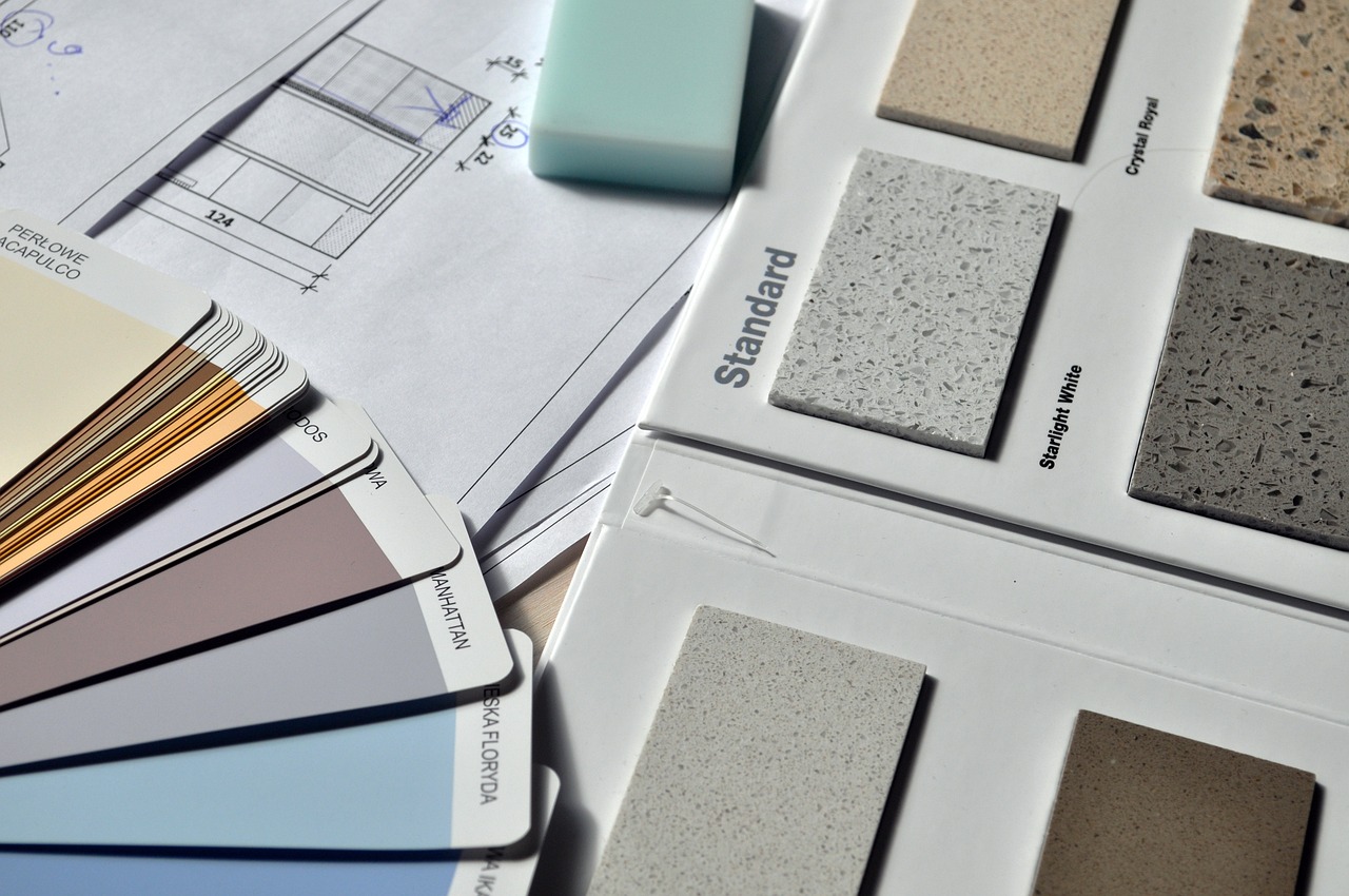
– Get paint samples or fabric swatches of your chosen colors. Test them in the actual room, considering how they look in different lighting conditions.
Think About Proportions:
– Decide on the proportions of each color in the room. The dominant color should cover the most space, followed by the accent colors, and then neutrals.
Create a Color Flow:
– Ensure a cohesive flow by using the same or related colors in adjacent rooms or spaces that are visible from each other.
Add Texture and Pattern:
– Think about textures and patterns that can enhance your color palette. Consider using materials like wood, metal, textiles, and artwork.
Experiment with Different Shades:
– Play with different shades and tints of your chosen colors to add depth and dimension to the space.
Personalize with Pop Colors (Optional):
– If you like, add a pop of a bold color as an accent to create visual interest and excitement.
Test the Palette:
– Once you have all the elements together, step back and evaluate how the colors work as a whole. Make adjustments if needed.
Don’t forget that the colors you pick for your place are like a reflection of your awesome style and the kind of vibe you want to create. So, take your time with this process. Try out different color combos. Feel free to experiment and let your creative side shine. Imagine how each color might make you and your guests feel – whether it’s cozy, lively, or chill. Trusting your gut feeling is the secret here. Just like when you’re picking your outfit, you go with what feels right. So, have a blast, follow your instincts, and let your colors tell a cool story about you and your space! 🙂
Leave a Reply