Welcome back to my blog! Today’s post is dedicated to tackling a common challenge – making the most of small rooms. Drawing on my years of experience, I’m excited to share a treasure trove of tips to transform compact spaces into stylish and functional sanctuaries. Let’s dive in!
Tip 1: Strategic Furniture Placement
When it comes to small rooms, the selection and placement of furniture play a pivotal role in shaping the overall aesthetic and functionality of the space. The key is to strike a delicate balance between comfort and functionality while avoiding the pitfalls of overcrowding.
Thoughtful Curation: Rather than succumbing to the temptation of numerous furniture pieces, focus on thoughtful curation. Identify the essential pieces that align with your lifestyle and the room’s purpose. This approach not only prevents the space from feeling cramped but also ensures that each item serves a purpose.
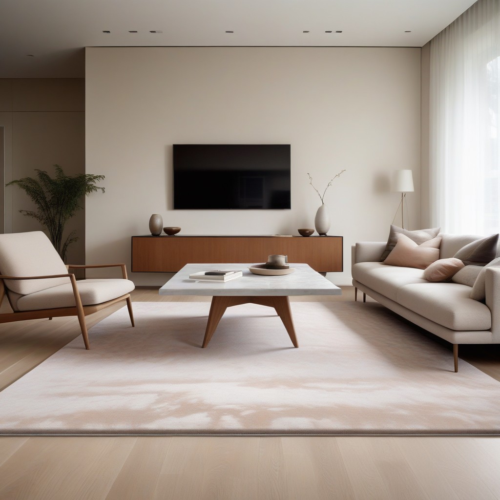
The Power of Key Pieces: Consider each piece of furniture as a protagonist in the room’s narrative. Opt for key pieces that anchor the space and contribute to a cohesive design. A well-chosen sofa, for instance, can become the focal point, radiating both comfort and style without overwhelming the room.
Embracing Creativity: Small spaces demand a touch of creativity. Explore unconventional solutions like tray tables and wall-mounted furniture to maximize efficiency without compromising on style. Tray tables, for example, serve as versatile companions, offering a surface for drinks or decor while maintaining a small footprint.
Wall-Mounted Marvels: The use of wall-mounted furniture is a game-changer in space optimization. By lifting furniture off the floor, you create a visual illusion of more space. Custom joinery, such as wall-mounted drawers or shelves, not only adds storage but also enhances the overall aesthetic appeal. This approach invites the eye to wander freely across the room, making it feel more expansive.
Balancing Scale: Pay meticulous attention to scale when introducing furniture into a small room. Oversized pieces can quickly dominate the space, making it feel cramped. Strive for a harmonious balance where each piece complements the others, contributing to an overall sense of equilibrium.
Multi-Functional Elegance: Small rooms benefit tremendously from furniture that wears multiple hats. Seek out pieces that serve dual purposes, such as a sofa with hidden storage or a coffee table that can double as a workspace. This not only optimizes the use of limited space but also adds an element of versatility to the room’s design.
Tip 2: Illuminating Insights
In the realm of small space design, lighting emerges as a powerful tool that transcends its functional role, becoming a transformative element that shapes the ambiance and perceived dimensions of a room. Tip 2 encourages a thoughtful and layered approach to lighting, offering illuminating insights into how strategically placed lights can work wonders in expanding and enhancing a confined space.
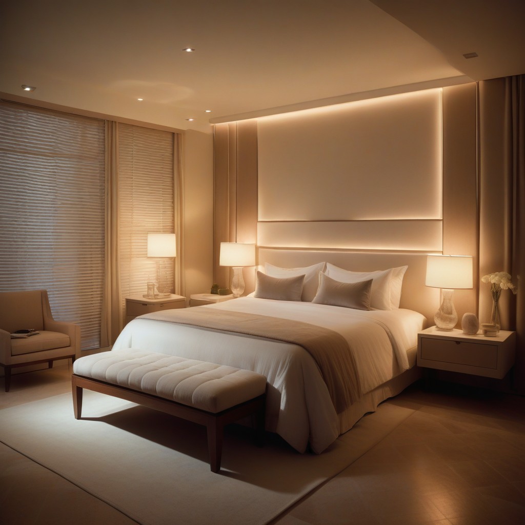
Advocating for a multi-dimensional approach, Tip 2 emphasizes the power of layered lighting to create visual depth and amplify the overall atmosphere. Diverse lighting fixtures, from table lamps to spotlights and chandeliers, are presented as characterful elements that contribute to the room’s design and purpose. Strategic placement of lighting fixtures is crucial, guiding the eye seamlessly across the space and preventing harsh shadows. Uplighters, often overlooked heroes, are highlighted for their ability to infuse drama and elevate perceived ceiling height, especially advantageous in confined rooms. Tailoring lighting to different purposes within the small space, such as task, ambient, and accent lighting, is recommended for a well-rounded illumination scheme. Ultimately, the tip underscores the enchanting potential of thoughtfully curated lighting schemes to craft illusions that make the space feel larger, airier, and more welcoming.
Tip 3: Reflective Magic with Mirrors
In the pursuit of maximizing space and infusing a sense of openness within small interiors, Tip 3 unveils the transformative potential of mirrors. Mirrors, often referred to as a designer’s secret weapon, have the innate ability to amplify space, introduce character, and reshape the visual dynamics of a room.
Mirrors stand as a timeless trick in the art of interior design, serving as an ingenious method to amplify the perceived dimensions of a space. Their reflective surfaces play with light, bouncing it around the room and creating an illusion of expansiveness. In the realm of small interiors, this amplification effect is nothing short of magical.
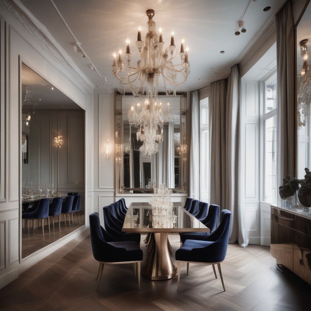
Mirrors with Character and Grandeur: it advocates for the use of unique mirror designs, such as antique or eglomise mirrors, to impart character and personality to small spaces. Mirrors go beyond functionality and become captivating art pieces that enhance the overall aesthetic. Going big with mirror size is emphasized for creating grandeur and the illusion of a more expansive room by reflecting a larger expanse of surroundings. This also encourages thinking creatively about mirror placements, suggesting integration into custom-built joinery like cabinets or shelving units for a cohesive effect. The strategic positioning of mirrors to capture and reflect light is highlighted, contributing to a brighter and more welcoming atmosphere. Overall, mirrors, when orchestrated effectively, create a symphony of reflections, adding depth and interest to compact interiors.
Tip 4: Flooring Finesse
This tip delves into the art of thoughtful flooring choices as a key strategy in small space design, aiming to create a harmonious, seamless, and visually expansive environment within confined dimensions. Advocating for the use of large format slabs, this tip highlights how these contribute to crafting seamless surfaces, reducing the prominence of grout lines, and achieving a cleaner, less cluttered visual effect. The tip encourages the strategic use of oversized rugs as design assets that extend beyond mere floor coverings. Going big with rugs is presented as a technique to visually expand the room, providing a continuous expanse of pattern or color that fosters a sense of continuity. The synergy between furniture and flooring is emphasized, particularly the placement of furniture with the front legs resting upon the rug. This not only creates a cohesive visual connection between different elements in the room but also enhances the overall airy atmosphere. Large format slabs and oversized rugs are positioned as visual tricks that, when employed together, play optical illusions, making a small space appear more extensive than its actual dimensions. This illusion is most effective when the flooring choice harmonizes with the overall design scheme, resulting in a unified and expansive aesthetic.
Multi-Functional Role of Rugs: Rugs in small spaces are not merely decorative accents; they serve a multi-functional role. Beyond adding visual interest, they define specific areas within the room and delineate functional zones. This serves to organize the space efficiently, contributing to both aesthetics and practicality.
Amplifying Atmosphere: The careful selection of flooring materials and rugs contributes to the overall atmosphere of the room. Whether you opt for sleek, reflective surfaces or plush, tactile rugs, each choice influences the tactile and visual experience within the limited space. Flooring finesse becomes a tool to amplify the desired ambiance.
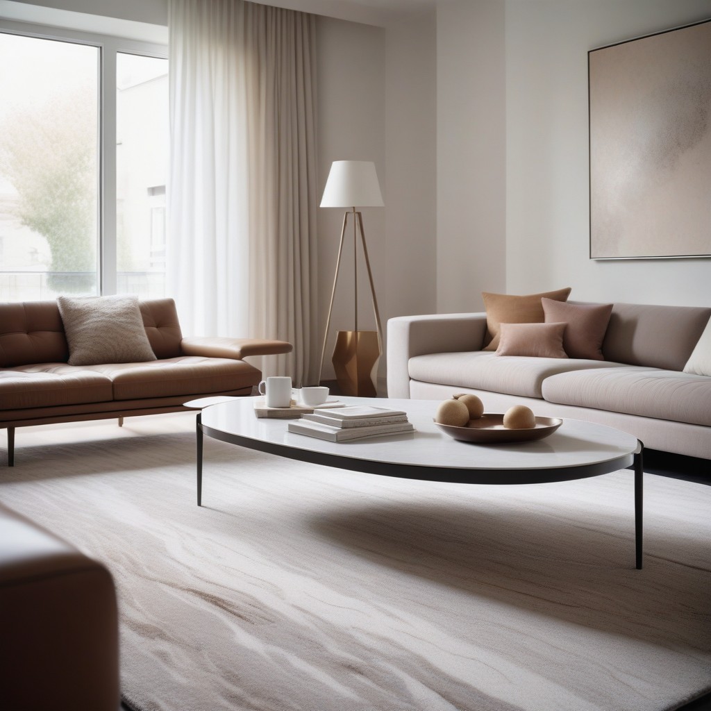
Tip 5: Bold Colors and Patterns
In the canvas of small space design, Tip 5 unfurls a liberating concept – the audacious embrace of bold colors and patterns. This tip challenges the conventional belief that small spaces should be clad in neutral tones, encouraging a departure into the realm of vibrant hues and eye-catching patterns to infuse drama, interest, and a distinct personality into confined interiors.
Defying Neutrality Norms: Gone are the days when small spaces were confined to a palette of neutrals. Tip 5 invites you to defy these norms, to step boldly into the world of colors that evoke emotion and patterns that captivate the eye. It’s a rebellion against the notion that small spaces should fade into the background; instead, they become dynamic expressions of personal style.
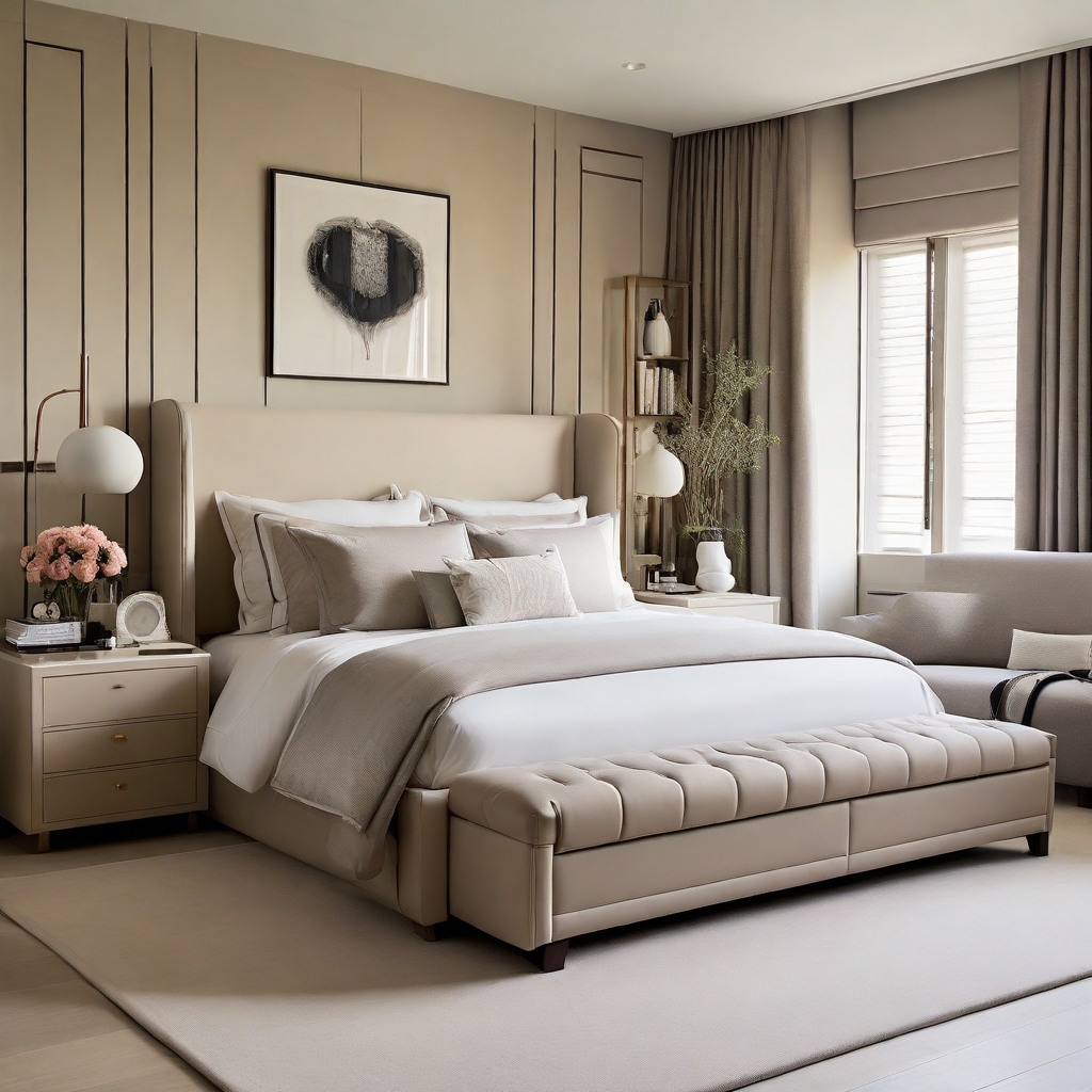
Coziness in Darkness: Contrary to the myth that dark colors shrink a room, Tip 5 reveals their unique ability to cocoon and create coziness. Dark hues, when applied thoughtfully, can turn a small space into an intimate retreat. Picture a deep charcoal accent wall or a rich navy sofa; these elements not only add depth but also dispel the idea that small equates to sterile.
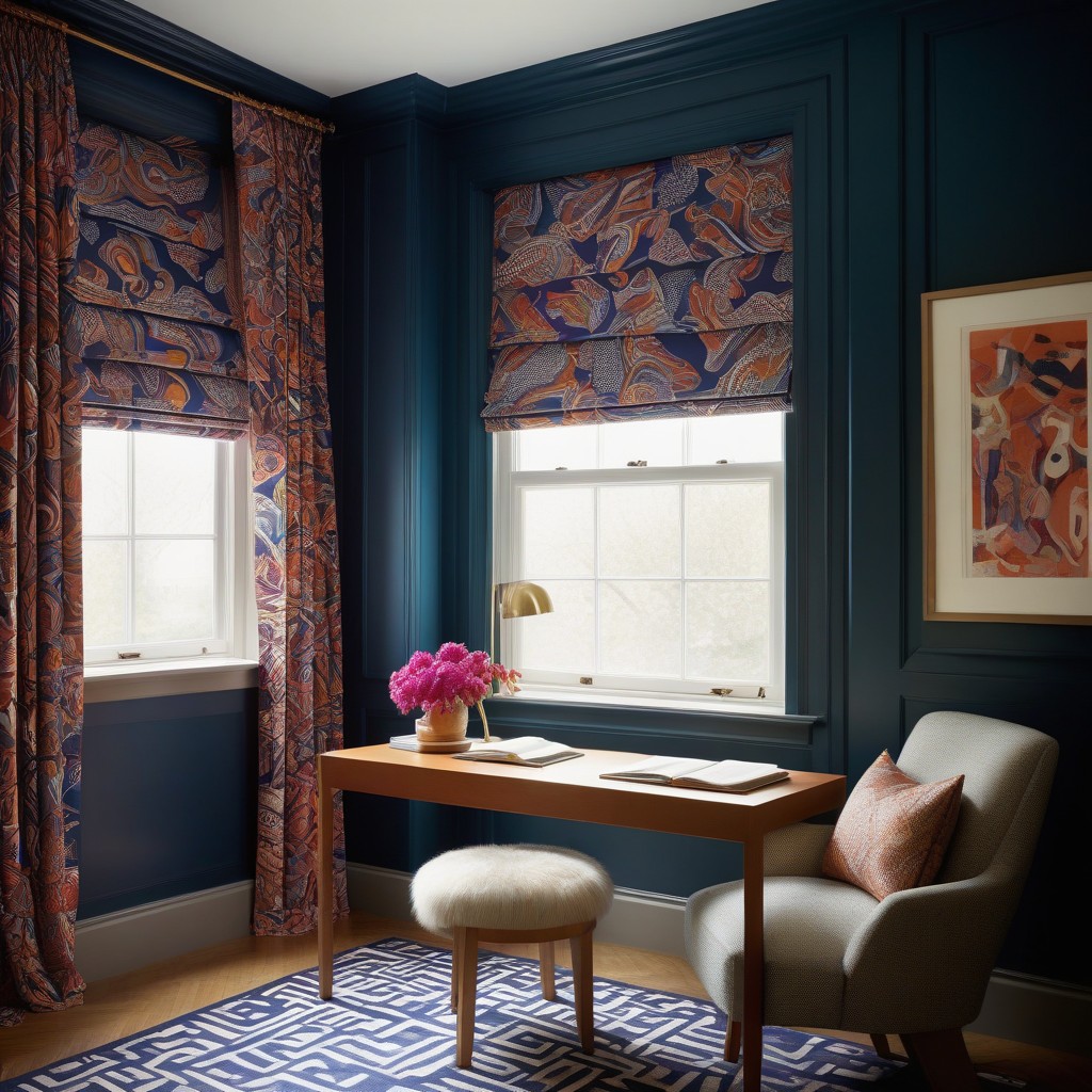
This tip challenges conventional design norms in small spaces, urging a departure into the realm of vibrant hues and eye-catching patterns to inject drama, interest, and a distinct personality into confined interiors. Patterns are positioned as conversation starters, especially bold and expressive ones, with this tip advocating their incorporation to prevent spaces from feeling bland and monotonous. The tip highlights the transformative power of patterns, emphasizing a statement roman blind adorned with an arresting pattern as more than a window treatment but as a visual exclamation point injecting life into the room. Visual drama is explored through the interplay of contrasts, where bold colors and patterns thrive. In a small space, each element is significant, and the juxtaposition of vibrant hues against neutrals or intricate patterns with solid backgrounds creates a captivating visual environment. Tip 5 elevates small space design into an opportunity for personalized aesthetic expression, encouraging the use of daring accent walls, boldly patterned rugs, or vibrant upholstery. It serves as a rebellion against blandness, infusing vitality into the space and ensuring that every corner tells a unique story, creating a visually stimulating environment where monotony has no place.
Tip 6: Consistent Color Palettes
In the intricate dance of designing small spaces with multiple rooms in close proximity, Tip 6 emerges as a guiding principle – the importance of maintaining a consistent color palette. This tip advocates for a harmonious approach, where colors weave a thread of continuity, fostering cohesion without overwhelming the senses. Whether embracing a palette of light or dark hues, a unified color scheme becomes the key to creating an environment that feels expansive and seamlessly interconnected.
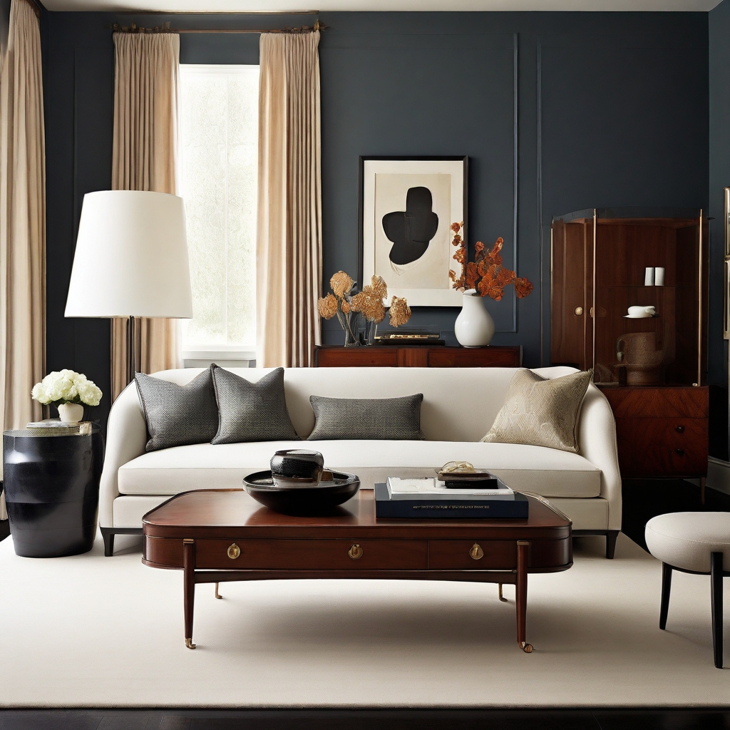
The Power of Harmony: Consistency in color palettes is a design harmony that resonates through interconnected spaces. Tip 6 emphasizes that this harmony is not just about matching colors but about creating a unified visual language that ties various rooms together. The result is an aesthetic symphony where each room plays a distinct note, contributing to the overall composition.
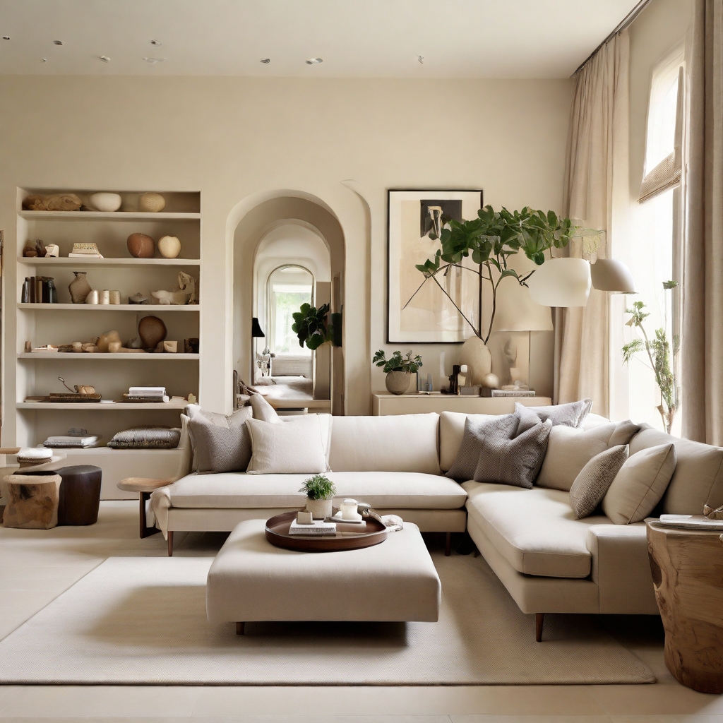
Visual Continuity: In small spaces where rooms share close proximity, visual continuity becomes paramount. A consistent color palette acts as a bridge, connecting different areas seamlessly. This visual flow dispels any abrupt transitions, making the entire space feel like a cohesive unit rather than a collection of disparate rooms.
Light or Dark, Choose Consistency: Whether your design inclination leans towards a light and airy aesthetic or a darker, cozier vibe, Tip 6 assures that the key lies in consistency. By maintaining a unified color palette, you can navigate the spectrum from light pastels to deep, rich tones without compromising the sense of harmony. The chosen palette becomes the anchor that grounds the entire design.
Tip 7: Multi-Purpose Furniture for Extra Storage
In the symphony of small space design, Tip 7 takes center stage, introducing a transformative concept – the integration of multi-purpose furniture for extra storage. This tip is not just about furnishing a room but about curating an environment where elegance seamlessly intertwines with practicality. From sofas with hidden drawers to bedside tables that double as storage hubs, Tip 7 advocates for a mindful selection of pieces that prioritize functionality without sacrificing beauty.
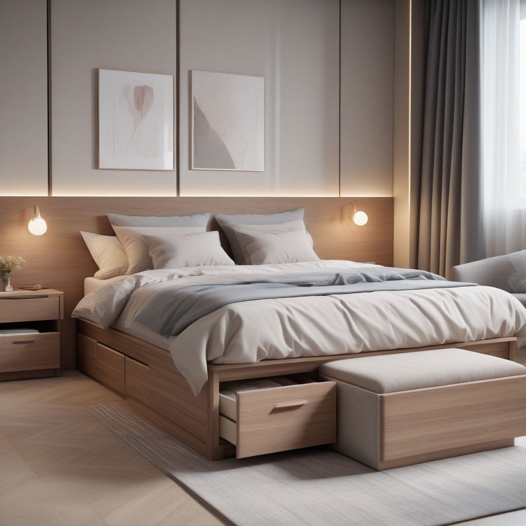
It goes beyond merely furnishing a room, aiming to curate an environment where elegance seamlessly intertwines with practicality. The tip celebrates the harmonious blend of elegance and practicality that multi-purpose furniture embodies. It advocates for a mindful selection of pieces that prioritize functionality without sacrificing beauty, highlighting the idea that furniture should contribute to the overall efficiency of a small space. Tip 7 introduces hidden storage solutions, such as sofas with concealed pull-out drawers and bedside tables with ample drawer space, providing secret repositories to declutter visible spaces and maintain an uncluttered aesthetic.
Tip 8: Built-In Joinery Brilliance
Positioned as a cornerstone principle in orchestrating small space design, Tip 8 advocates for the transformative potential of built-in joinery, transcending conventional furnishing. This tip champions an investment in custom solutions that optimize every inch of available space, introducing a level of efficiency and visual sophistication that standard furniture often cannot achieve. Despite the initial investment, built-in joinery becomes a strategic and invaluable asset in crafting a small interior that seamlessly balances form and function. From custom-designed wardrobes to open shelves and recessed features, it introduces bespoke solutions tailored to the specific needs of the space, enhancing storage capacity and contributing to a clutter-free and organized environment.
Tip 9: Curtain Considerations
In the intricate choreography of small space design, Tip 9 takes center stage by guiding individuals through the nuances of curtain considerations. Focusing on the weight of the fabric and the positioning of curtain poles, Tip 9 unravels the secrets to achieving drapery elegance that maximizes the allure of small spaces. Acknowledging that small spaces thrive on a sense of airiness, the tip encourages the selection of lightweight curtain fabrics. Opting for materials that gracefully sway in the breeze introduces an ethereal quality to the room, allowing natural light to filter through while preventing the curtains from dominating the visual landscape.
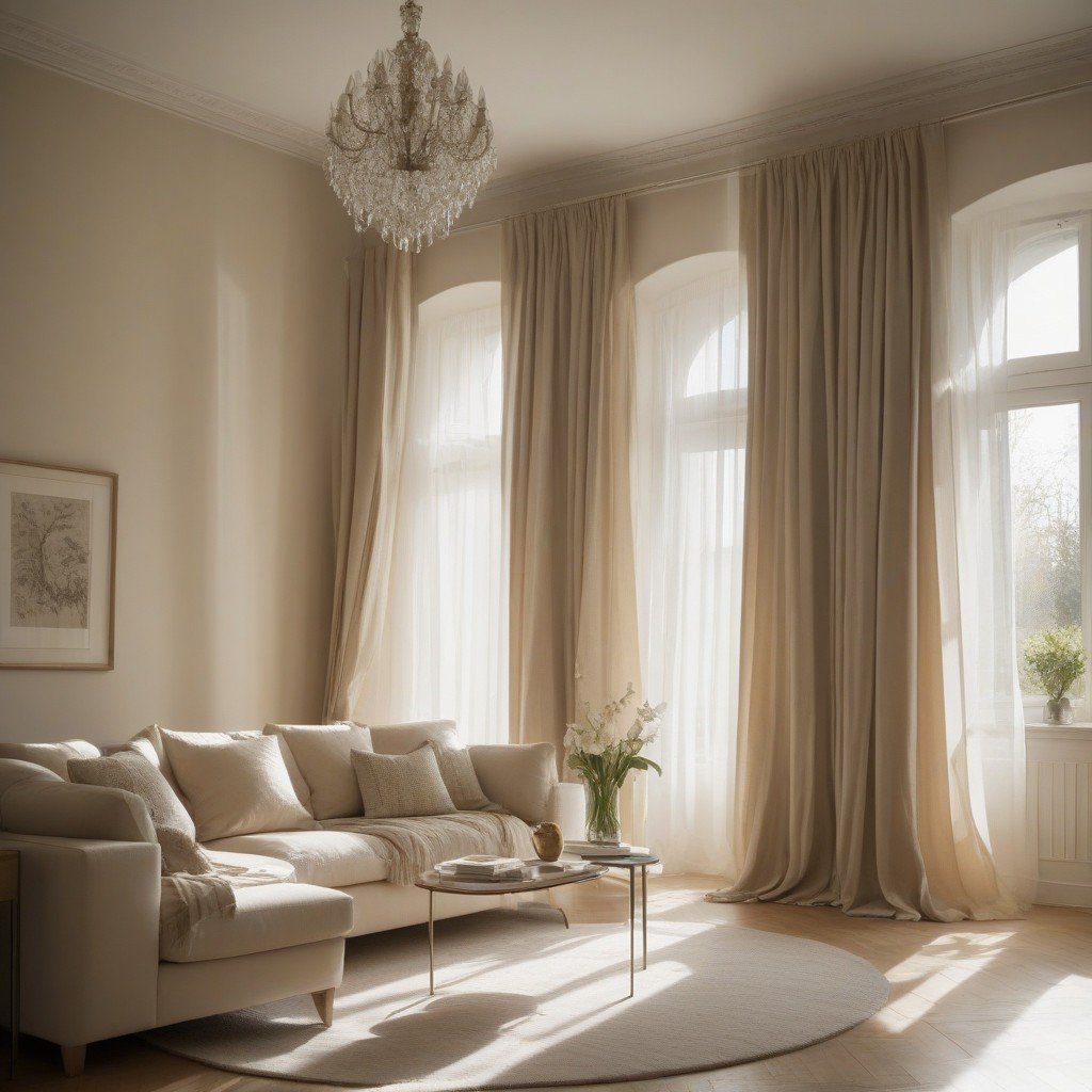
Placing curtains high, near the cornice or ceiling, draws the eye upward, creating the illusion of heightened space and a more expansive feel. To maximize floor space, the tip introduces Roman blinds, a sleek alternative that elegantly folds upward, ensuring an uncluttered aesthetic. Emphasizing the importance of natural light, Tip 9 advocates for choosing curtains that strike a balance between privacy and light penetration, favoring sheer or semi-sheer fabrics. Furthermore, the tip advises tailoring curtain choices to space constraints, avoiding overwhelming patterns and opting for subtle designs that harmonize with the overall aesthetic, becoming integral elements in the dance of small space optimization.
Tip 10: Declutter for a Breathable Space
As the final note in the symphony of small space wisdom, Tip 10 invites you to embrace the transformative power of decluttering. In a world where less is more, this tip underscores the idea that simplicity is not just a design choice; it’s a pathway to creating a breathable, serene space. With the ethos that decluttering costs nothing but yields invaluable results, Tip 10 serves as a gentle reminder that the key to making a small space feel larger lies in the art of letting go.
The Minimalist Manifesto: At its core, Tip 10 is a nod to the minimalist manifesto. It acknowledges that a clutter-free environment is not just visually pleasing but contributes to a sense of calm and tranquility. By paring down to the essentials, you allow the inherent beauty of your possessions to take center stage, transforming your small space into a sanctuary of simplicity.
Clearing Surfaces for Visual Breathing Room: Decluttering is akin to clearing the air. Tip 10 encourages you to liberate surfaces from unnecessary items, providing visual breathing room within your confined space. When countertops, tables, and shelves are unburdened by excess, the room instantly feels more expansive, allowing the eye to glide effortlessly across the uncluttered landscape.
Cherished Possessions in the Spotlight: In a decluttered environment, your cherished possessions become the protagonists of the story. Tip 10 emphasizes that the beauty of your treasured items, whether a piece of art, a unique artifact, or a carefully chosen decor piece, shines brighter when not competing for attention amid clutter. Each item gains significance, and the room becomes a curated gallery of your personal taste.
Creating Serenity through Simplicity: Simplicity is a conduit to serenity, and Tip 10 acknowledges this truth. By removing excess belongings, you create a space that is not only aesthetically pleasing but also emotionally calming. The simplicity achieved through decluttering fosters an environment where the mind can rest, and the senses can savor the beauty of the carefully curated.
What sets Tip 10 apart is its accessibility. Decluttering costs nothing but yields high-impact results. It requires no financial investment, only a willingness to reassess and release. This simple step, often underestimated, has the power to transform the dynamics of a small space, turning it from cramped to comfortable without a single penny spent.
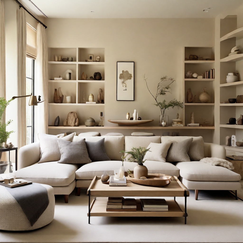
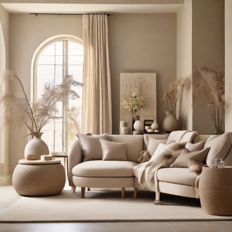
As we reach the culmination of this exploration into the nuances of small space design, I trust these tips will be beacons of inspiration as you navigate the realm of compact living. Crafting a stylish and functional sanctuary within limited square footage requires ingenuity and a dash of creativity. Remember, the true beauty of a small space lies not just in its aesthetic, but in its ability to seamlessly align with your lifestyle. Each tip shared here is a stepping stone, guiding you toward a harmonious blend of comfort and design. Thank you for being a part of this design journey, and here’s to the exciting chapters of small space living that await you.
Leave a Reply